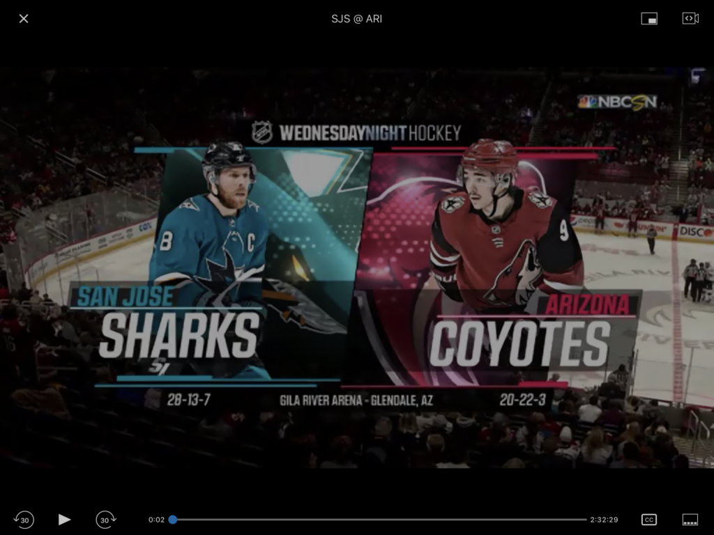
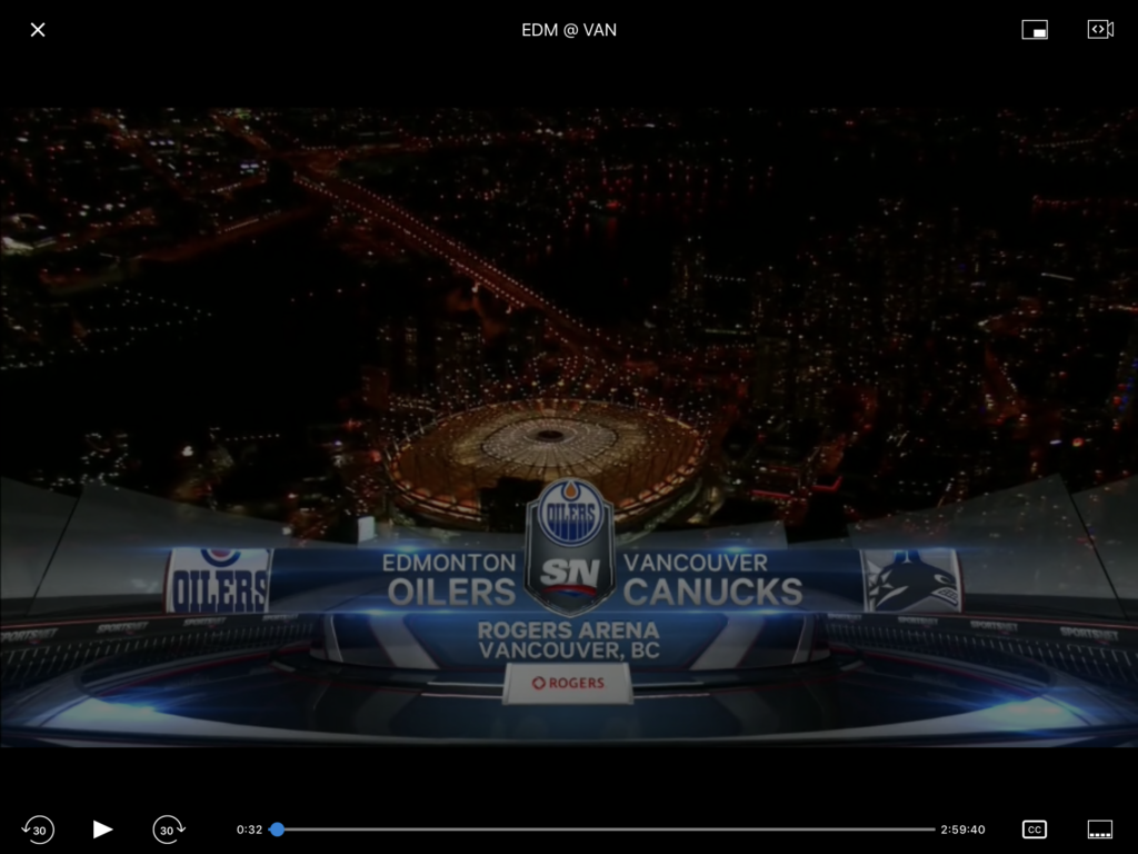
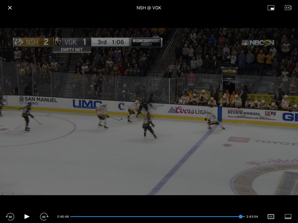
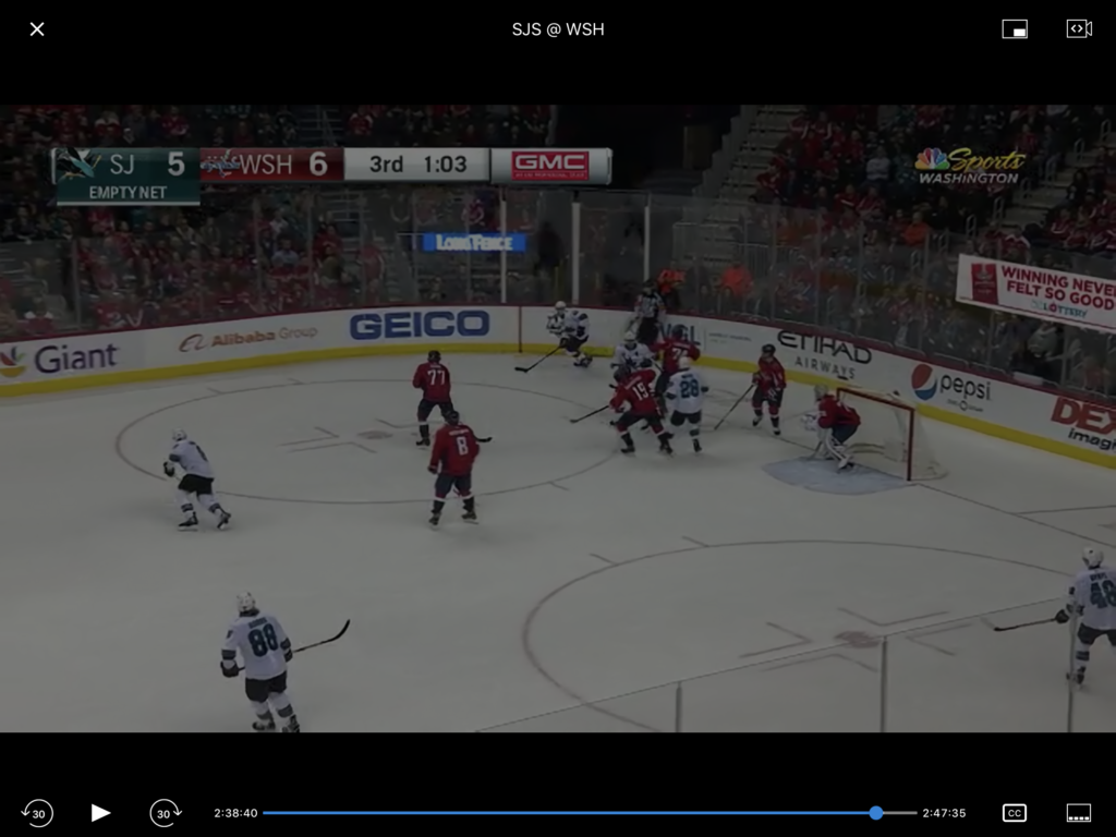
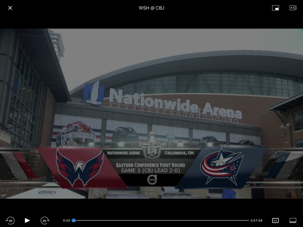
The simple solution seems to run the video length for all games to a defined length, say 3:10, to accommodate longer broadcasts. This should work for most regular season games, but becomes difficult in the post season. NHL playoff games don’t allow for tie games, so overtime goes on until a team scores. Games can run on longer, much longer!
For this redesign, I assume that videos will run at various lengths (there will be no developer attempt to set video lengths.)
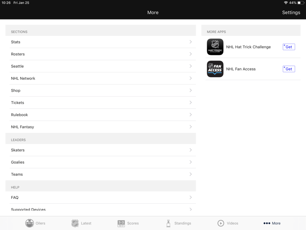
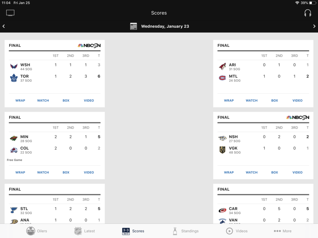
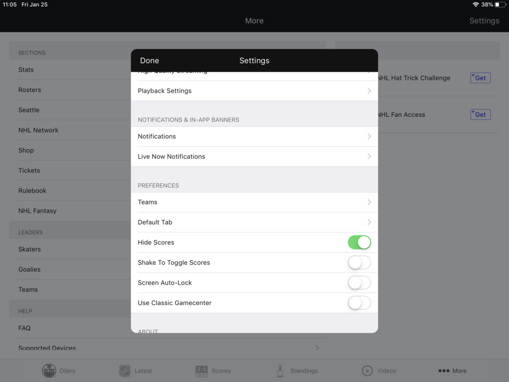
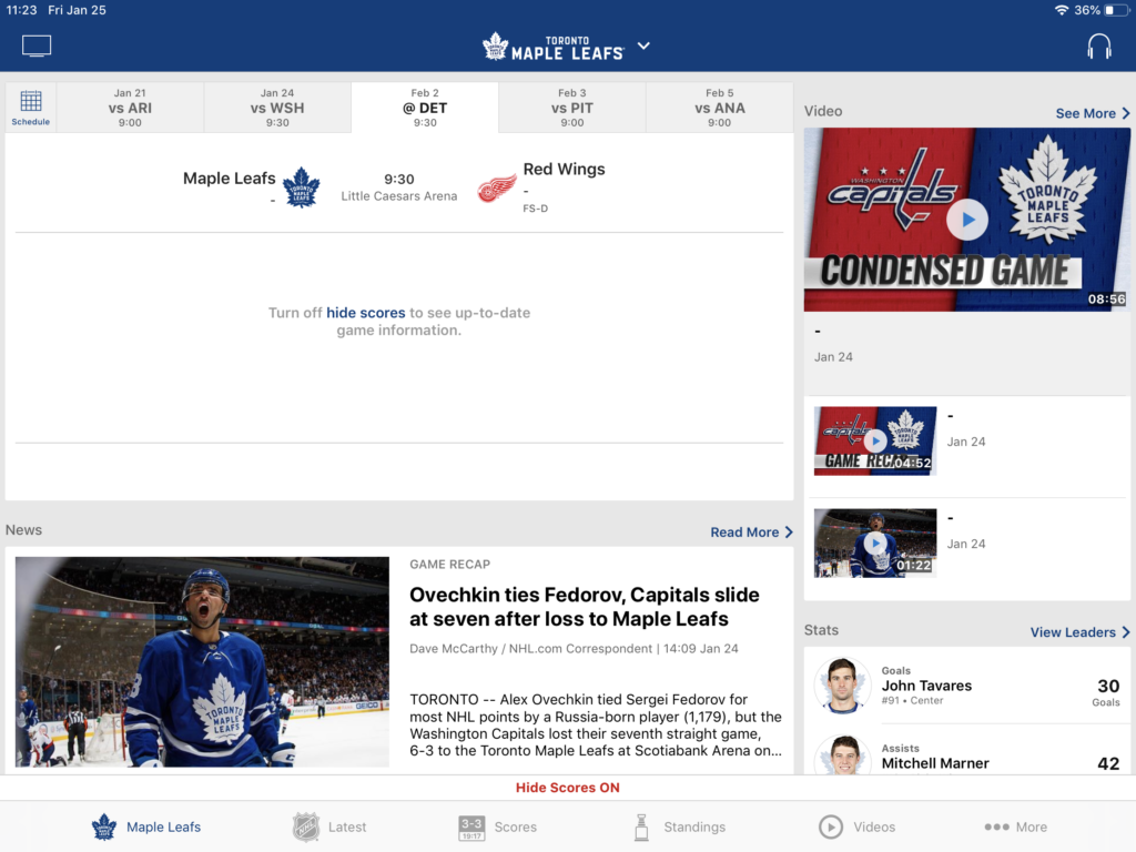
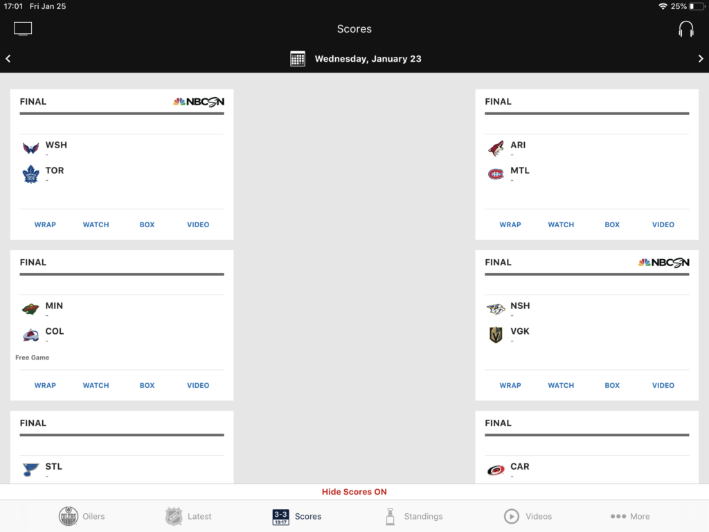
The second challenge is to view the game without being spoiled by the playback.
Challenge #3 – Cut the Fat
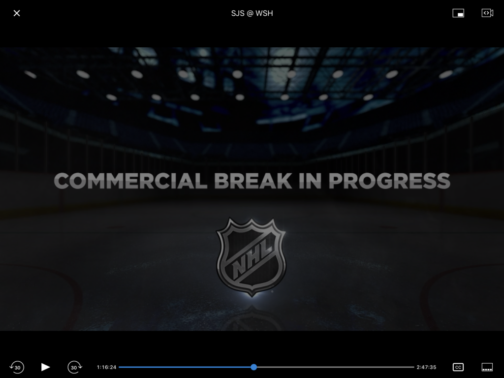
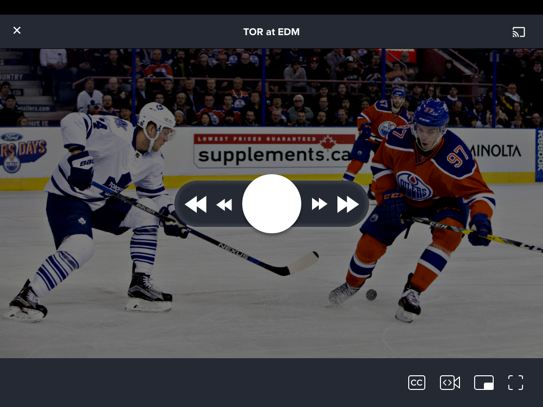
Finally, a smaller consideration but important for on-demand viewers, how to skip commercial breaks. The broadcast playback cuts to a holding screen for the duration of a commercial break – somewhere around 1:40 and 2:00. Yet the video playback controls only offer skip ahead and skip back at 30 second intervals. You have to hit skip ahead 4 times in a row (you can’t do this all at once either, the video must load to the new time frame before skipping further.) The fine scrub controls work fine, but there is always the danger of skipping ahead a little too far, just a small inconvenience, but can add up when repeated several times through the break. Scrubbing also brings up the dreaded time remaining display!
The other break happens in between periods – less fine scrubbing is necessary for this.
The third challenge is to make skipping commercial breaks an easier affair.
Ideation
Get to the Game
My first instinct was to split the user experience into two personas:
- People who just want to watch a game (live or on-demand) i.e. “Viewers”
- People who want to check scores, standings, news, etc. i.e. “Browsers”
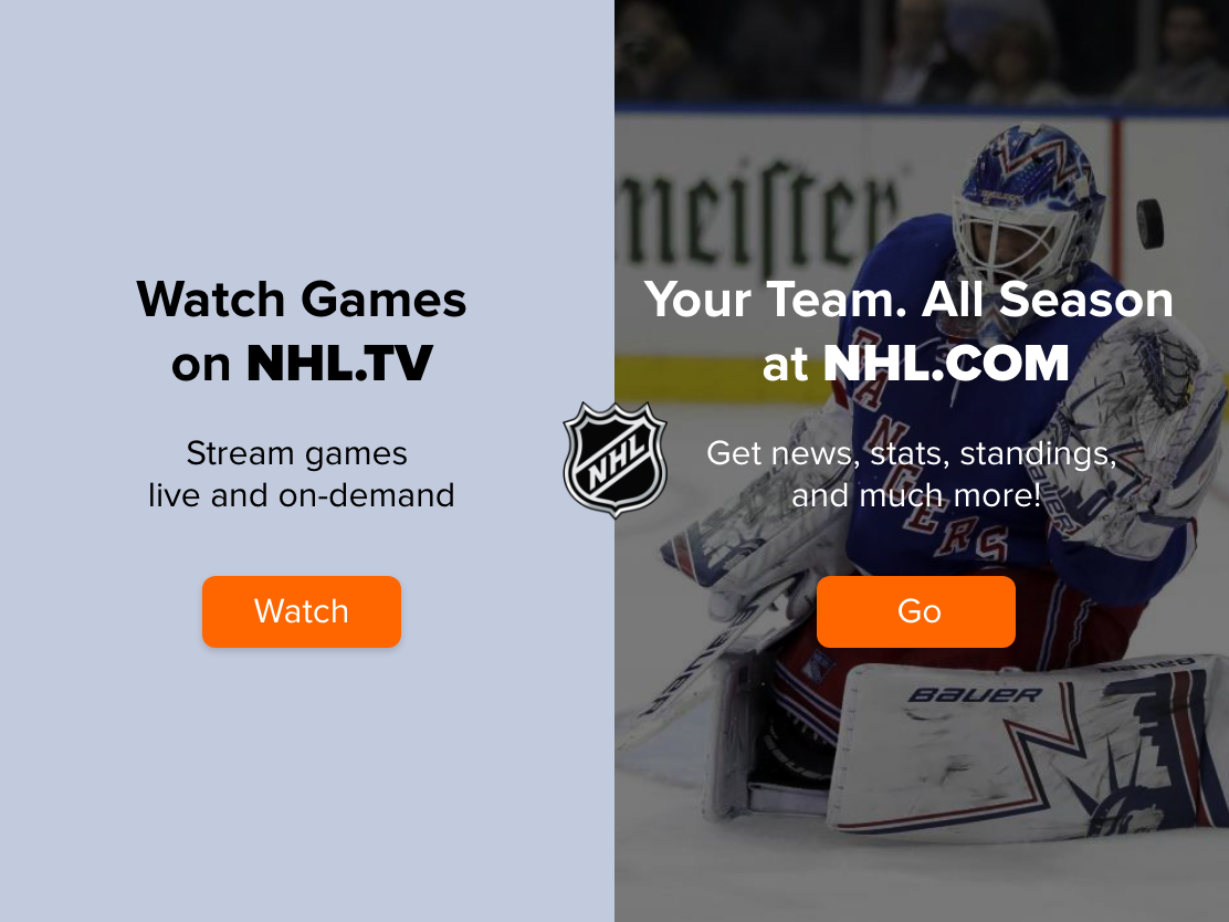
This would bring them to different landing pages. I make the following assumptions:
- Viewers do not want to be spoiled, whereas spoilers are optional for Browsers.
- Viewers are focused on getting to a game viewing experience in as few steps as possible.
Stay in the Dark / Cut the Fat
Once viewers are in an on-demand game viewing state, the default viewing experience should be to:
- skip commercials and breaks between periods (FWD 30 sec / 2 min / 10 min intervals)
- pause the game
An option to open the scrubbing controls would be one further tap to avoid spoilers
When doing any of these things, the viewer shouldn’t get an idea of how much time is remaining in the video (i.e. it should be as close to a live viewing experience as possible.)
Wireframes
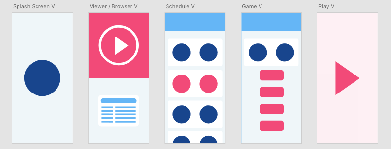
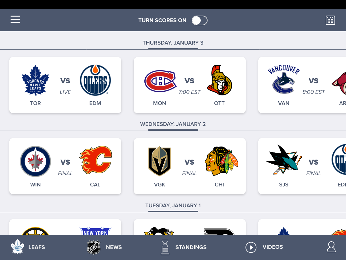
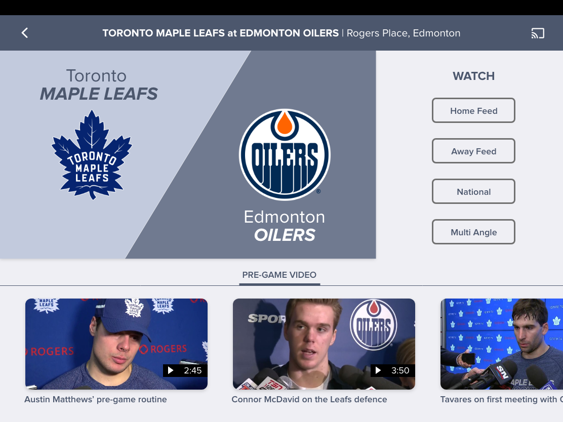
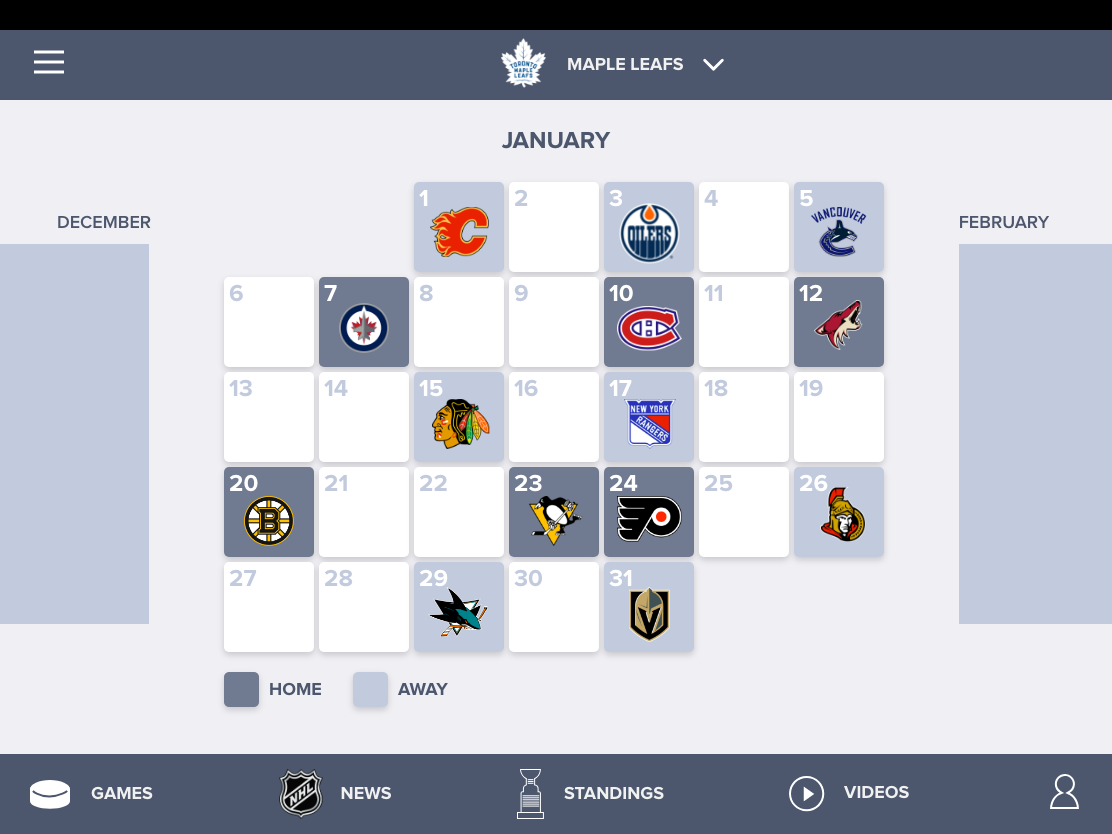
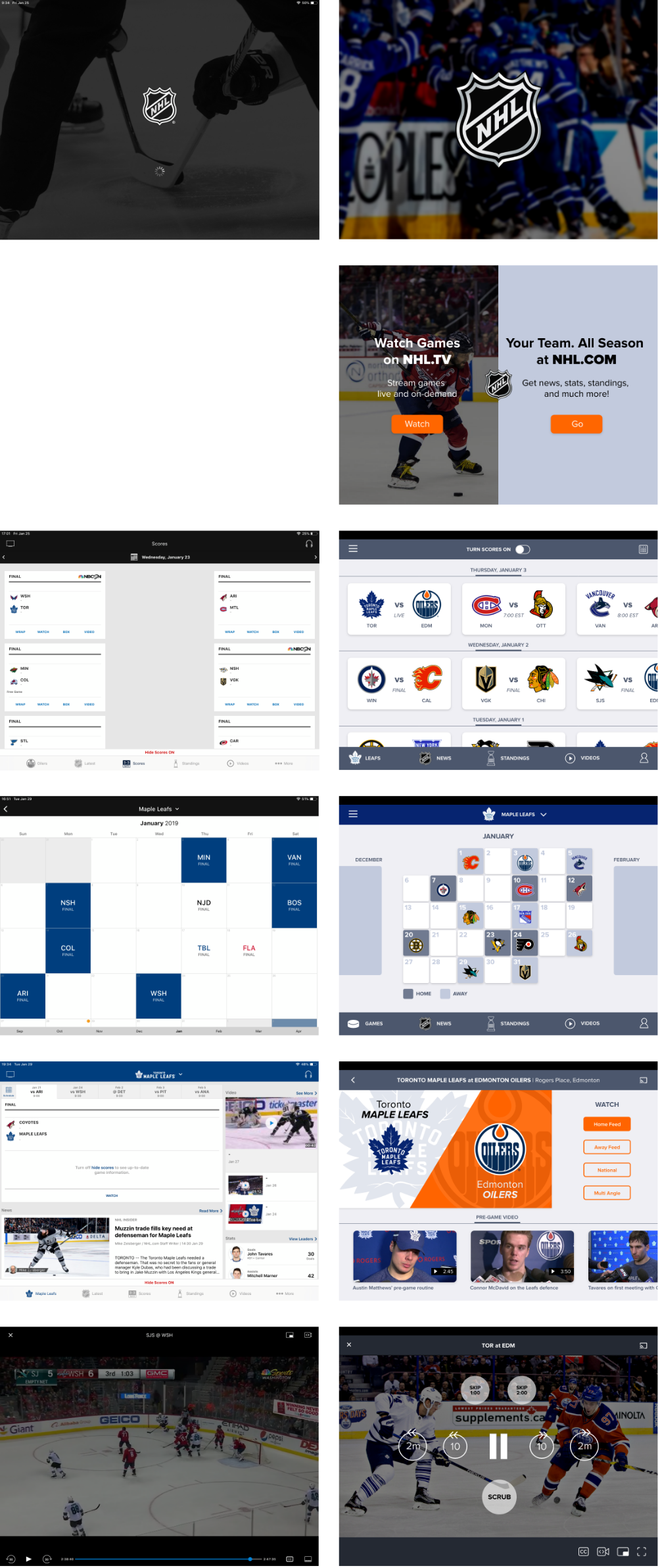
I took the iPad format as the default, assuming people would be watching on their devices. Here is a simple mock up of the screens to get to a game video.
The basic flow is as follows:
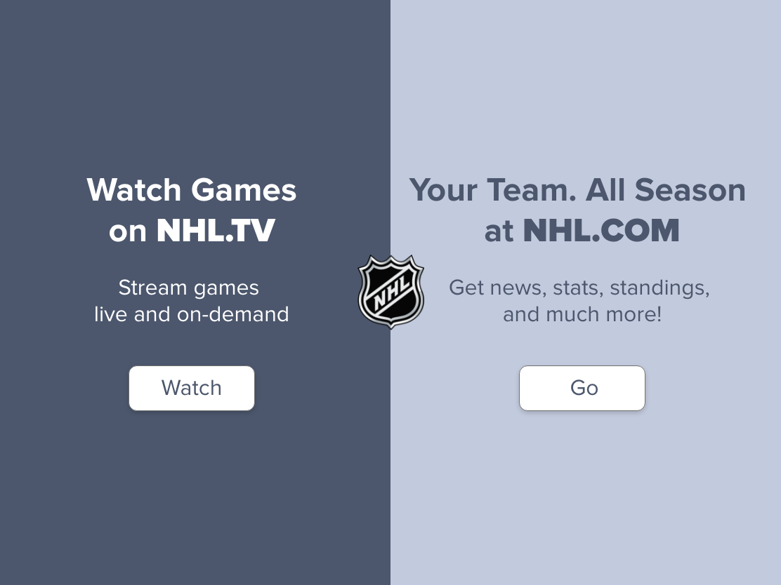
- Splash page
- Viewer / Browser selection
- Schedule
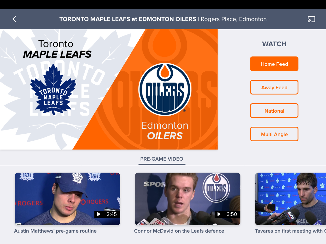
- Game
- Play
And here is the iPhone layout.
Hi Fidelity Mock up
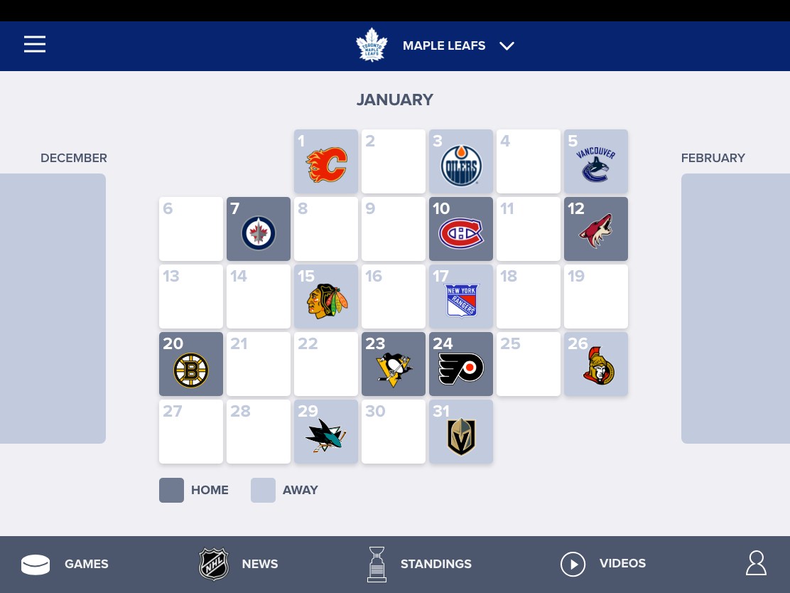
Here are the pages in a simple hi fi mock up (monochrome). I added a team schedule (option page for users to follow their favourite team.)
I then added some light styling.
And here are the pages side by side in comparison to the real app.
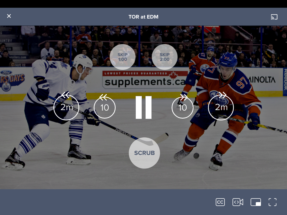
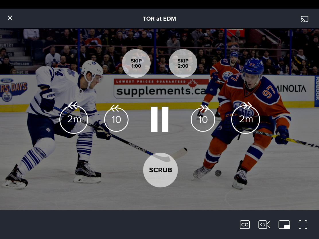
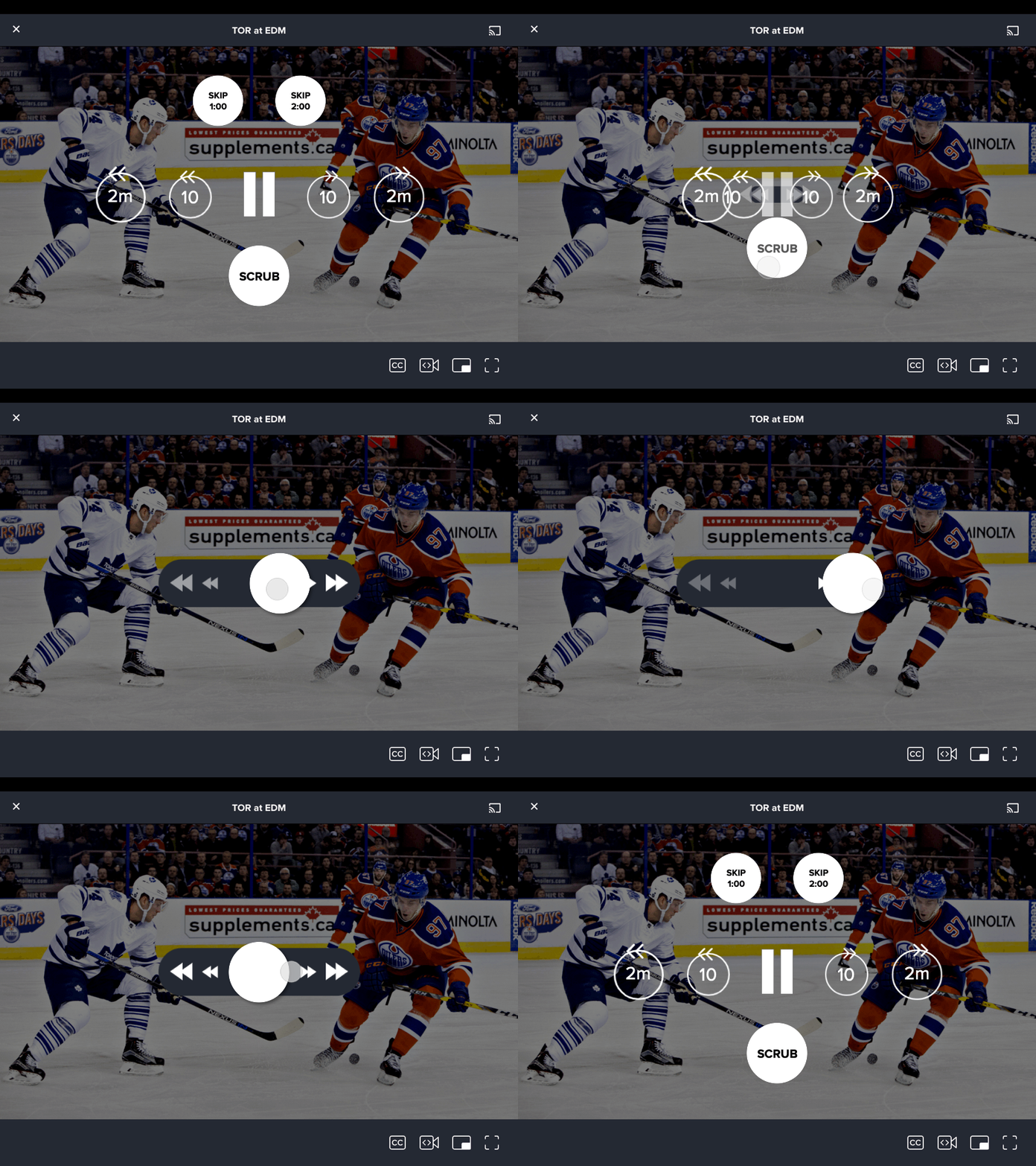
Here is the player control panel. A simple skip 10 seconds and 2 minutes allow for skipping commercial breaks. I added two buttons at the top, which would skip to 1:00 and 2:00, which are time stamps close to the broadcast start of the second and third periods. Finally, a scrub button for finer control of rewind/fast forward controls.
And here is a simple scrubbing control for when the user wants to rewind or fast forward. Tapping the “scrub” button on the previous screen will get this display.
Finally I made a simple animation of the scrubbing panel.
Closing Thoughts
While the NHL has done an excellent job with their app in terms of offering a complete package of news, media, and stats, the experience for users who just want to watch the games is lacking. Hopefully future iterations can integrate more (or less!) features that accommodate these users.

