What is it?
A UI for a simple CYOA (Choose Your Own Adventure) app based on a business trip through Tokyo.
What does it do?
The story is based on an activity that I wrote for students learning active English skills. They have to navigate a complex public transport system by asking the right sort of English questions, with only their wits to rely on.
Context
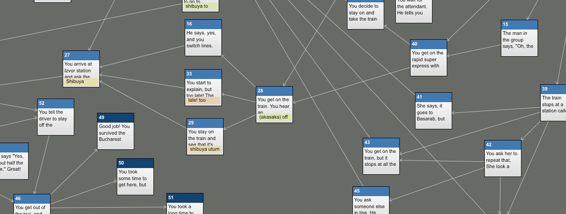
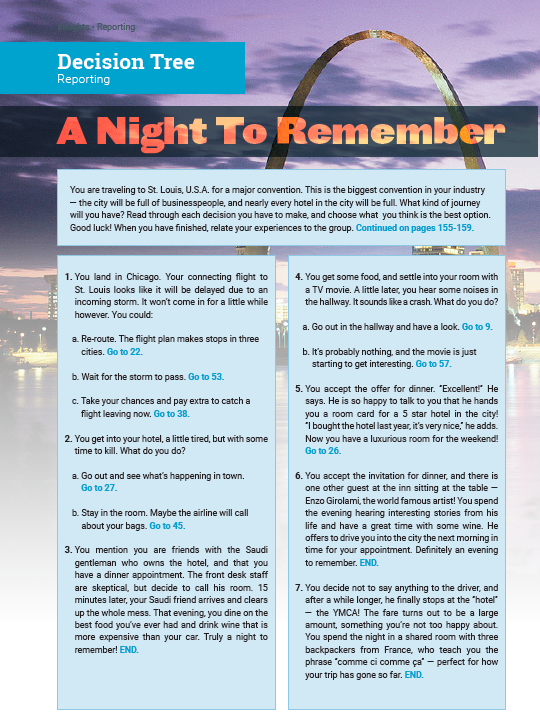
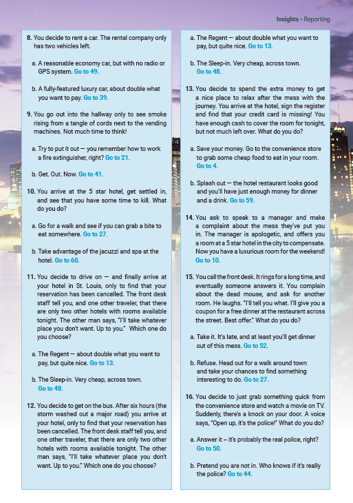
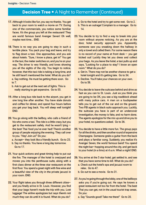
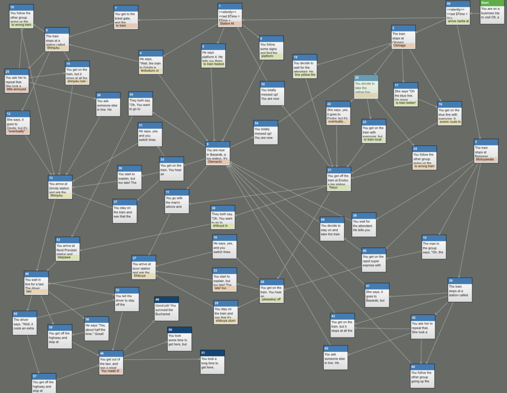
I wrote the story using Twine, (see the original Twine screenshot below) and designed it as a multi-page spread to be used in a textbook (below).
As the original activity was rather cumbersome (there are over 50 different scenarios requiring students to flip back and forth multiple times through the textbook), I wanted to adapt it for digital use.
Main Objective
The main goal of the original activity was to highlight different active speaking strategies for learners of business English. Learners received feedback on their choices either directly from the characters in the story, or by ending up on “good” or “bad” paths. In a classroom situation with a paper-based textbook, instructors mediated the experience, giving hints, verbal feedback and advice on the learner’s choices. However, a digital app would assume a single reader with no mediation. The main challenge was to provide enough feedback from the app itself to replace the instructor-mediated experience. In the end, I considered two basic user experiences:
1. Using the app as learning material
2. Interacting with the story for fun
Hopefully not mutually exclusive!
Other Considerations
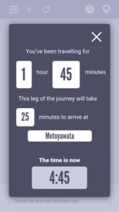
The original activity tracked multiple variables throughout the reader’s journey. These were (in order of importance):
1. Time taken to get from place to place (in minutes)
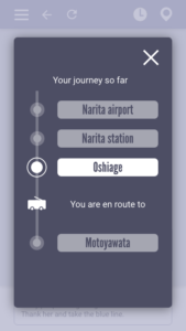
2. A rudimentary map of the route taken (optional only)
3. Money spent on tickets
Learners were responsible for tracking these on a separate piece of paper. Three basic outcomes of the story were written based on the time spent (less than xx minutes // between xx & xx minutes // over xx minutes).
Project Map
The original Twine story looked like this:
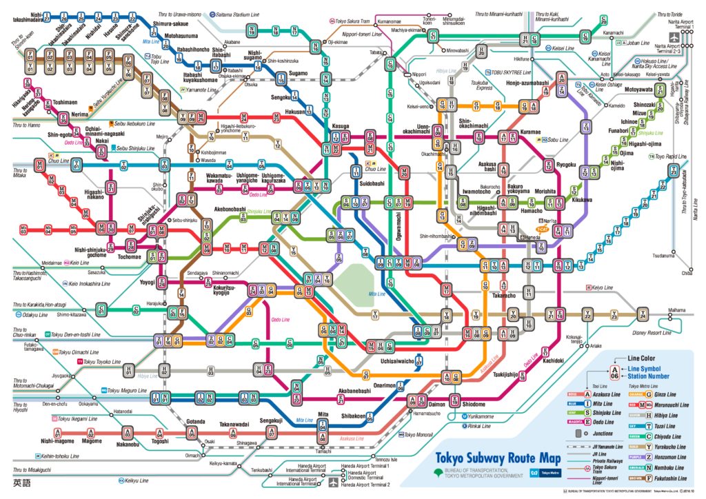
The story structure in the image here loosely corresponds to the Tokyo subway map.
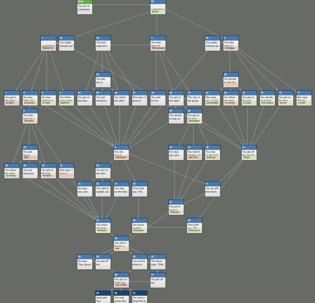
Here is a cleaned up version of the Twine story structure.
Still quite complex! Each story node would require its own page. However, there are only four basic page types:
1. Landing page
2. Scenario page
3. Outcome page
4. Results page
And a page map would look something like this.
Note that although page types were rather simple, background images for each would need to be made. I would tackle that later.
Lo-fi Mockups
I made some lo-fi mockups of the basic pages with Adobe XD …
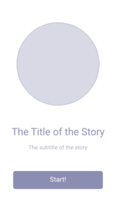
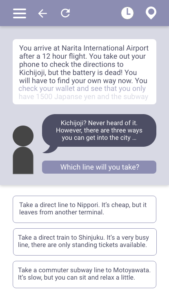
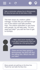
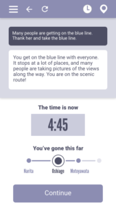
[landing page] [scenario page] [outcome page]
… and some basic interactions with Principle.
[landing page –> scenario page]
[scenario page –> get a hint]
[scenario page –> outcome page]
[check status]
[check route]
Around this time, I decided to drop the money tracking feature. It just didn’t add anything to the overall experience for the user.
Hi-Fi Mockups
Now that the necessary data was in place, it was time for the styling. I made some one-color Hi-Fi Mockups, seen below. Unfortunately, the project was discontinued at this stage.

